

Introducing Data Visualization in D3 JavaScript library
Nowadays, we are flooded with data. We are living in the information era. How could it be otherwise? Our cyber-activity, our devices, the billions of sensors placed on practically every inch of free space, all contribute to an endless data stream. We collect it and try to make any sense of it. But how to sift the stream? How do we know what is valuable and what is not?

Table of contents
It is in the answer to this question that data visualization becomes an essential tool. Using this tool, businesses (and others, of course) can tame the data and derive conclusions from adequately visualized datasets, thus greatly improving their decision making. Data visualization helps our brains to comprehend complex dependencies by displaying them in a more brain-friendly, graphical way. It is a tool which helps us understand our world better.
What is D3 all about?
D3, which stands for a Data-Driven Documents, is a JavaScript library created for data manipulation and visualization. It enables you to visualize your data using plain HTML, SVG and even Canvas API.
To begin with, D3 can be confusing, especially if you’re looking for simple predefined charts that you can quickly apply to your project. However, if you invest a little time to master (or at least get familiar with) this library you can make powerful, fully animated aesthetic charts relatively easily.
In this short introduction to D3, we will use global electric power consumption data as an example dataset. Our goal is to help the user obtain all the information that this data can provide.
How to start with data visualization
When it comes to data visualization there are a number of variables to be considered. Alberto Cairo, the author of “The Truthful Art”, states that good data visualization has to be:
- Truthful
- Functional
- Beautiful
- Insightful
- Enlightening
When we choose how we want to visualize our data, these are the features that we need to consider before beginning.
Let’s try to apply the above assumptions in practice by visualizing the Worldwide Electric Power Consumption (kWh per capita) dataset from The World Bank. We want to visualize the levels of power consumption in each country.
Sometimes the simplest solution can be the most efficient. And that’s why we’ll start with a simple line chart. Take a look at our data schema:

We have 264 records, organized alphabetically by country, with a consumption rate in kWh assigned in the value column. In order to visualize it, we will use the D3-shape module.
Note: Since version 4 of D3 uses a modular approach, it’s easier to load and implement only the functions we need, the build is small and it can be even smaller using a module loader like webpack or rollup.js, thanks to tree-shaking_.
Since we need to scale our data to an SVG canvas, we’ll be also using the linear scale from the D3-scale.
Note: for a full working example click HERE
After adding the axes and labels, we have our first version of the data.
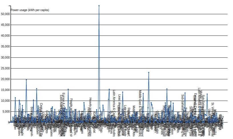
Let’s see if the chart complies with Cairo’s visualization statements.
We can say that it’s truthful because we haven’t hidden any data nor have we manipulated the scales; we have simply shown all the values within the same scale. But to be honest, we have so much going on in the chart that it could be misleading. We can make our chart wider and try to visualize all the countries on the axis, but it would still be too much data to analyze at once, and that makes it hard to find or draw conclusions about data trends or patterns.
So, in the case of truthfulness, let’s say it isn’t perfect and the same goes for being functional. Is this chart beautiful? I don’t think so. We’re not adding any ‘junk’ but we could definitely make it more appealing. However, when there’s so much happening in a chart, beauty becomes difficult.

Is this chart insightful? Is it enlightening? The same problem exist as with truthfulness. It shows all the data, but can we process it? Can we see which regions have greater power consumptions? What differences are there between the northern and southern hemispheres? It’s hard to tell from the chart in its current state.
In order to fix some of these issues, we can try to show only certain data, or to group some countries by continents or regions.

But with this approach, we lose some of the insights and thus we can accidentally direct the user to pay attention to certain data at the expense of the rest. That’s not always a bad thing. Another time we may want to show how much bigger/smaller the consumption is in Western Europe compared to Eastern, but in this case we want to show it all so that the user can find those comparisons by themselves. Our goal is to make this chart as enlightening as it can be.
So how can we visualize this data to make it a better data visualization? Perhaps we can categorize the power consumption and sort the data that way? Maybe we can use another type of chart or diagram?
Based on the assumptions we have chosen above and because we can observe some similarities based on the geographic location of the countries, we’ll try to address these issues by visualizing them as a map.
Using geodata for visualization
Many datasets based on geographical location can be visualized as a map. Geographic Information Systems (GIS) provides us with variety of functions, ideas and algorithms to make that possible.
_Note: to find out more about GIS ecosystem check out Open Source Geospatial Foundation (OSGeo) page.
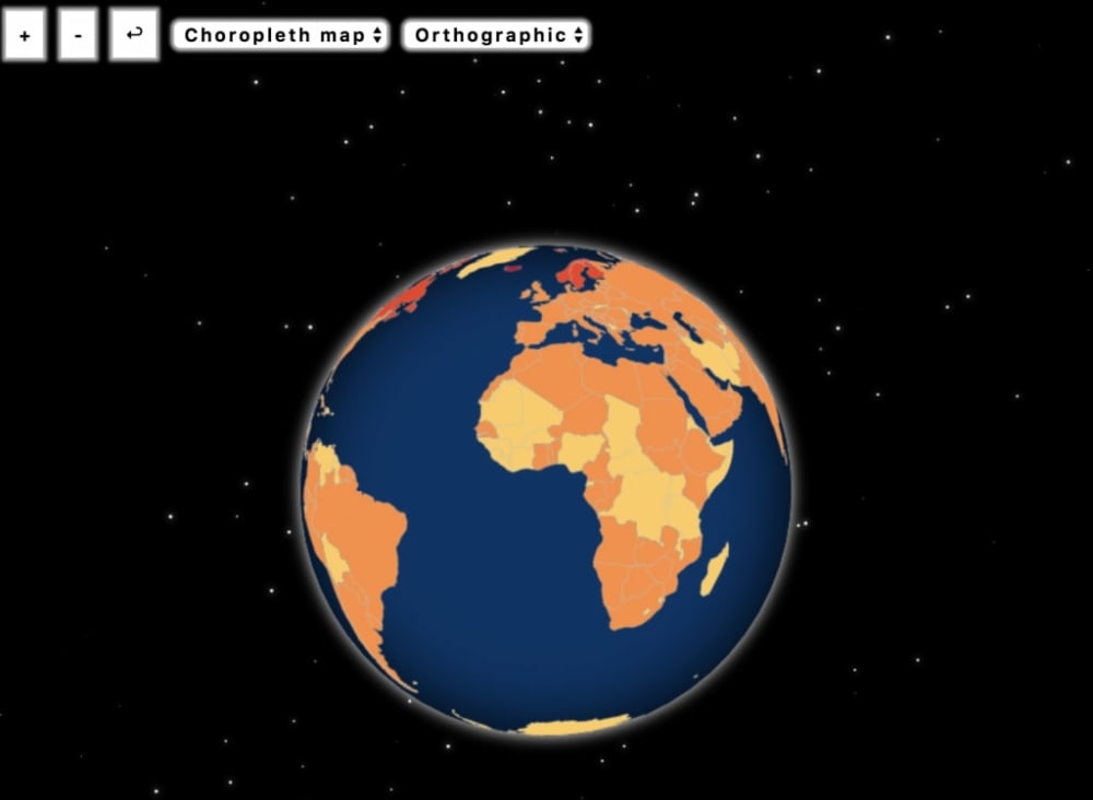
To make our data more interesting (we could say: more insightful and enlightening) and more appealing (beautiful) to a user we will visualize the dataset as a map. Furthermore, we’ll display it as an interactive globe so that users can spin the globe around to observe different regions and zoom in to a point of interest.
In order to make this happen we have to use a projection from D3-projection and geoPath from the D3-geo module.
At first, we have to define what type of data we have: local, countrywide, or worldwide. This is important because we have to determine which geographic projection to use. On a local scale we have to remember that each country has its own national coordinate systems by which all maps are visualized. So, using different coordinate systems to visualize data can result in different shapes and rotation for countries.
Web Mercator
On a worldwide scale, we have global coordinate systems. In this case the most popular projection is Web Mercator also known as Google Web Mercator. It’s a variant of the Mercator projection and is based on spherical formulas. It has became a standard for a web mapping in the global scale visualizations.

An orthographic projection
Another interesting projection is an orthographic projection. The aim is to visualize 3D objects in two dimensions (e.g. on a web browser). D3 provides us with an geoOrthographic projection which enables us to visualize the Earth as a globe (or in this case as a planar circle). The downside of this projection is that we won’t be able to fit all of the continents on our canvas as we would in a Mercator projection. However, we can change the projection rotation when the user interacts with our map, enabling them to focus on their points of interest.

Visualizing the world
To visualize the whole world, we need to apply our power consumption data. By joining our data with a GeoJSON of the world we were able to populate our map with actual data values (all the missing countries or values were set to 0).
Then we have to decide how we want to visualize our data. In our line chart example, we were visualizing power consumption values on the Y axis. In this case our axes are our coordinates so we need to find a way of visualizing them. In this case, there are two popular ways to visualize the dataset:
- Choropleth map – values are displayed as colors which can represent categorical or continuous values.
- Bubble map – values are displayed as bubbles where their diameter represents a linearly scaled dataset or is used for categorical representation.
Before we decide which visualization will be more beautiful, it’s more important to think about which type will be more insightful: one type (choropleth) enables us to easily identify regions with similar values; on the other hand, the other (bubble) enables us to easily compare values (by the size of the bubbles).
The bubble map
Firstly, lets see how the bubble map serves our purpose. In order to create it we have to create a scale for the bubbles. We can use a linear scale from D3-scale or a categorical scale in order to define categories with the values we want to represent. After choosing a scale, we place our bubble in the geometric center of the specific country. Now we are good to go with data visualization.
The choropleth map
In order to create a choropleth map, we have to prepare a colored scale to which we apply the previously prepared categories.
D3 offers many color schemes and most of them are based on Cynthia Brewer’s ColorBrewer.
Note: Cynthia Brewer is an American professor of geography and her most notable work – ColorBrewer – aims to deliver effective schemes for thematic or choropleth maps that are usable for web, print, and also colorblind people.
If we’re looking for a color scale for our data, we can use one provided by a D3-scale-chromatic module or we can prepare a scheme basing on ColorBrewer’s online application by ourselves. If we’re using continuous data we won’t be able to use ColorBrewer, but D3 provides some continuous color scales (using one-dimensional b-spline interpolation for the RGB values). In this case we’re using a discrete scale.
After we prepare our visualization, we can compare both maps on the example below. Feel free to experiment and try analyzing these visualizations with Cairos statements.
Note: full working example code.
Analyze the visualization
Now it’s time for the most important part of the process. We have to validate the visualization.
Is it truthful?
We have countries placed on a globe with their power consumption representation with the same linear scale applied. We show every country and the data assigned to it. In a situation where values are missing, we can show them in a separate color.
Is it functional?
In this case our approach provides the user with the basic information, but it is missing country names and value labels and the user may have a problem comparing data from different parts of the globe.
Is it beautiful?
These versions are more appealing to the user. Thanks to ColorBrewer, we have provided functional and aesthetic colors for our data. We have also enriched the globe with shadows and glow effects (also we added a few stars to the surrounding space).
Is it insightful and enlightening?
At this point our visualization enables users to draw conclusions based on countries’ locations. It’s easier to look at the dataset as individual regions, and without preparing any additional visualization, so we can say that it is now more insightful and enlightening.
Unfortunately, our visualization suffers from the ‘chart junk’ which is, “visual embellishments that are not essential to understanding data” (Bateman S. et. al.), so our chart has sacrificed a bit of a functionality in favor of beauty.
Our last step is to make our visualization more functional by reducing that ’chart junk’. To do so, we use a specific Mercator projection which allows the user to analyze data from every country without rotating the globe.
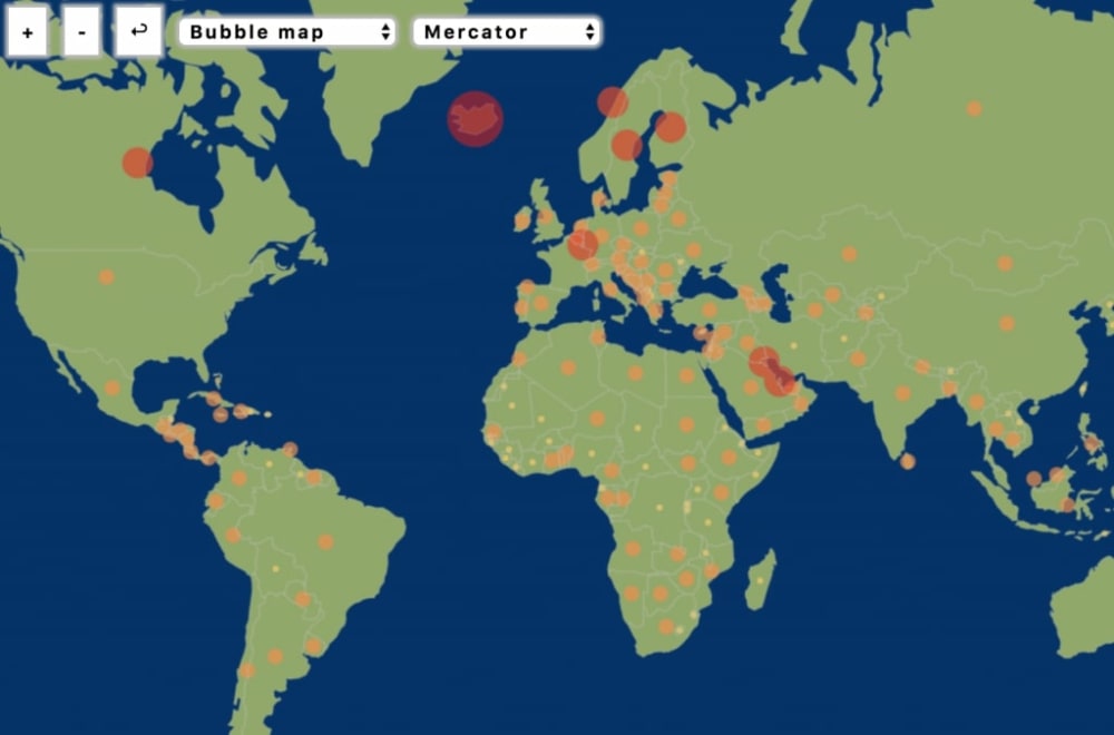
Finally, our visualization is easier to read, more functional, and the user can easily compare different countries and regions. At the same time, it is still pretty much an aesthetic solution.
Pro-tip: The 3D globe solution could be more efficient if the spherical shape of the Earth was included, e.g. for cruise ships route and plane trajectory visualizations, day and night light pollution and many more details.
Conclusions
In this brief guide, we have only covered the basics of data visualization, focusing on mapping. To improve our visualizations we could implement a better labelling engine (currently, the labels appear only if the scale is enlarged). We can implement this by ourselves, or by using an alternative mapping library, such as Leaflet.js (which works with D3).
We can also improve the visualization’s performance – this example is based on a 2D canvas, but for a more interactive 3D visualization it might be better to use WebGL solutions (there is support for D3 in Three.js, a 3D JavaScript library).
The way in which you build your visualization matters but the most important part of the whole process is to analyze the problem you want to illustrate with the data, and know how you want to show it.
Now that you know the basics of data visualization, you can start making some of your own! If you want to make some with us, let’s talk then.
References:
“Useful Junk? The Effects of Visual Embellishment on Comprehension and Memorability of Charts”
Share this article: