Corel Discovery Center
Reesponsive interface re-design
Interface Design, Architecture, Wireframes, Graphic Design, Content Management

Discover new ideas with Corel
A brand new idea, UI & UX design of the Discovery Centre – Corel.com section dedicated to knowledge hunters. This project is part of an overall strategy for rebuilding the Corel.com website to enhance its usability and improve conversion. We supported our client in the modelling of a new brand idea, with emphasis on creating an online space for knowledge exchange by the active community. We decided to expose an extremely wide range of tools, tutorials, articles, and hints which, in an earlier version of the UI, were largely invisible. Information architecture re-building features an exceptionally broad base of knowledge and, above all, a changing user experience.
Design performed by a remote agency may seem unrealistic or time-and-money-consuming at first sight. Corel Corporation, another well-known customer of ours, provides further proof that graphic design, created in Poland to be used in Canada and beyond, is not only possible but also time efficient and reliable in terms of timing.
On the occasion of changing the website, we offered a broader solution – a change of the brand colour palette and its fonts. This idea was as much inspiring as it was challenging, we had to find a solution grown from the earlier style, which users were accustomed to, and new ideas.
Graphic Design implementation was provided by an external development team – we delivered our work so as to be the best basis for implementation by the front-end developers from a different country. We also performed the post-deployment audit which assured the client of the quality of implementation.
What
General web visual strategy, content planning, user workflows, target group selection and specification of its needs, as well as dedicated user interface design – these elements were combined to deliver to the Customer the final effect of re-building the website according to their goals. The aim of the project was to broaden the target group of users of the tools of this graphic software vendor and to build and support their community of users who actively participate in online webinars, improving available tutorials and at the same time binding them to the brand.

How — Information Architecture, Wireframes, and Moodboards
Information architecture and content planning were adapted to enhance visibility of the most frequently used content. Analysis of users' previous behaviour showed us the right direction and gave us good foundations for our design decisions and prioritisation of content and sections. We also took into consideration users who had never used some of the content that was available on the previous web page before and accordingly, we presented it differently, emphasising its values and presenting it in a new form.


How — Final Graphic Design and Alternative Versions
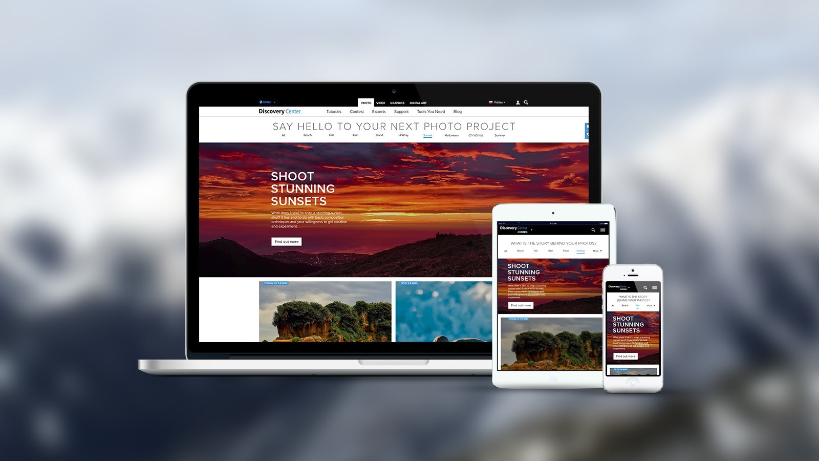
Two different graphic design propositions were delivered to the customer; one was based on the idea of keeping the colour pallet of the brand, the other refreshed and changed the colour scheme as well as text and photo presentation. Both versions of the Corel Discovery main page introduced a new set of fonts and handcrafted icons which created consistency for the whole website. All service pages, by paying special attention to the images, presented possibilities for using knowledge that can be acquired through learn.corel.com.


Why
The easiest way to learn about photography, video, graphics, and painting is to have access to an environment that will support you with top-notch content. Tips, tutorials, and tools for photographers, art designers, and video creators are your daily friends on the way to becoming more efficient and professional. We always want to learn so it's a pleasure to be a part of this community and to be able to support it with our skills.