

Design system - boosting your software development
Incorporating design system within your digital products makes it easier, faster and cheaper to develop software at various levels of maturity. It’s like building a cool car with Lego bricks: you know what to do, and you know where each part belongs. You take element after element and connect them to build the thing you’re aiming for. The tricky part is that you need to first create each brick and make sure that it will fit. But this is our part in the process.
Table of contents
If your business strategy is based on various apps, web pages and online platforms then both you and your users will benefit from creating a design system. Airbnb uses theirs to ensure that their various platforms have a consistent ‘voice’ in terms of appearance and function.
Ecommerce giants Etsy use theirs to tie together different products and different brands. Whether you’re developing, scaling or maintaining a range of digital products, a design system provides a consistent integrity and identity while streamlining your technical development and support.
Sounds great! And ‘design system’ has become an industry buzzword for a reason. Let’s take a closer look at what design systems are, what they’re for, and what benefits you should be aiming to get from yours.

What is a design system?
The simplest way to view a design system is as part-template, part-toolkit. It’s a collection of parts, principles and standards that you can use in a software development project – bits and pieces that save you having to invent the wheel all over again and that help ensure that each digital product you develop is in line with the rest of your ‘digital family’.
A design system should be accessible to all roles involved in the building process of the digital product and the whole organization should be aware of its principles and why it has been implemented. It also can be treated like a set of patterns that allows designers to use similar solutions (or “scripts”) for various situations in the product.
In other words, all your apps, platforms and websites are clearly from the same overall organization, with a consistent look and feel for users. As you might imagine from that description, there’s a heavy emphasis on UI and UX. The final goal of design system implementation should be a consistent customer experience.
As such, while every development project is unique, the contents of your design system guide the design process, informing the final look and experience associated with the final product.
Design system and technology stack
Nowadays, the frontend of most modern applications is built using React Native app development or Angular. Those frameworks and their UI libraries are already based on small, reusable components.
Companies like Boldare, who already combine them with a design system can improve and speed up the design and development process, and achieve a competitive advantage over the companies who use the above mentioned technologies without an implemented design system.
Design system principles
So, what are the benefits of a design system? What’s it for? What can you expect to achieve by developing (and then using) a design system?
From a business perspective, a design system improves efficiency in the development process. Once you’ve decided what you need to design and why, the design system either provides, or guides your decisions on, how to achieve that. Assuming you’re working according to agile principles, with a sprint-based scrum-style development process, you’re not starting every sprint from scratch.
The contents of the design system give you either readymade code elements to include in the sprint’s product increment, or guidance on what the increment should look and feel like to the user. There’s still a great deal of room for creativity and variance; in other words, a good design system doesn’t get in the way of designing a product that is focused on both user and business needs. A design system is supportive of the development process, not restrictive.

Naturally, these design system benefits also apply to the work of the development team. Knowing precisely the UI and UX they’re aiming for, and equipped with a variety of standardized tools and components to start the work, team members are working within a much more streamlined and predictable development process. They can use the design system contents with confidence, knowing that they have been signed off because they’re proven to work. Moreover, the design system’s rules and standards are clear on where and under what circumstances deviation is permitted (because it’s essential to making this product a success) and where it isn’t.
For users, products developed using a design system are more consistent and predictable due to their family relationship with your business’s other products. Wherever possible, familiarity is built-in, and any differences for users are there because they are necessary.
Who should use a design system?
There are no technical or systemic limitations. Anyone who wants to build a digital product effectively, will benefit from a design system. It’s suitable for both an MVP app and a mature product during the scaling phase. A design system boosts the process of building new products or adding improvements to existing ones, and grows together with the application.

Design system components
With the basics established, it’s time to look inside and find out what a design system typically includes:

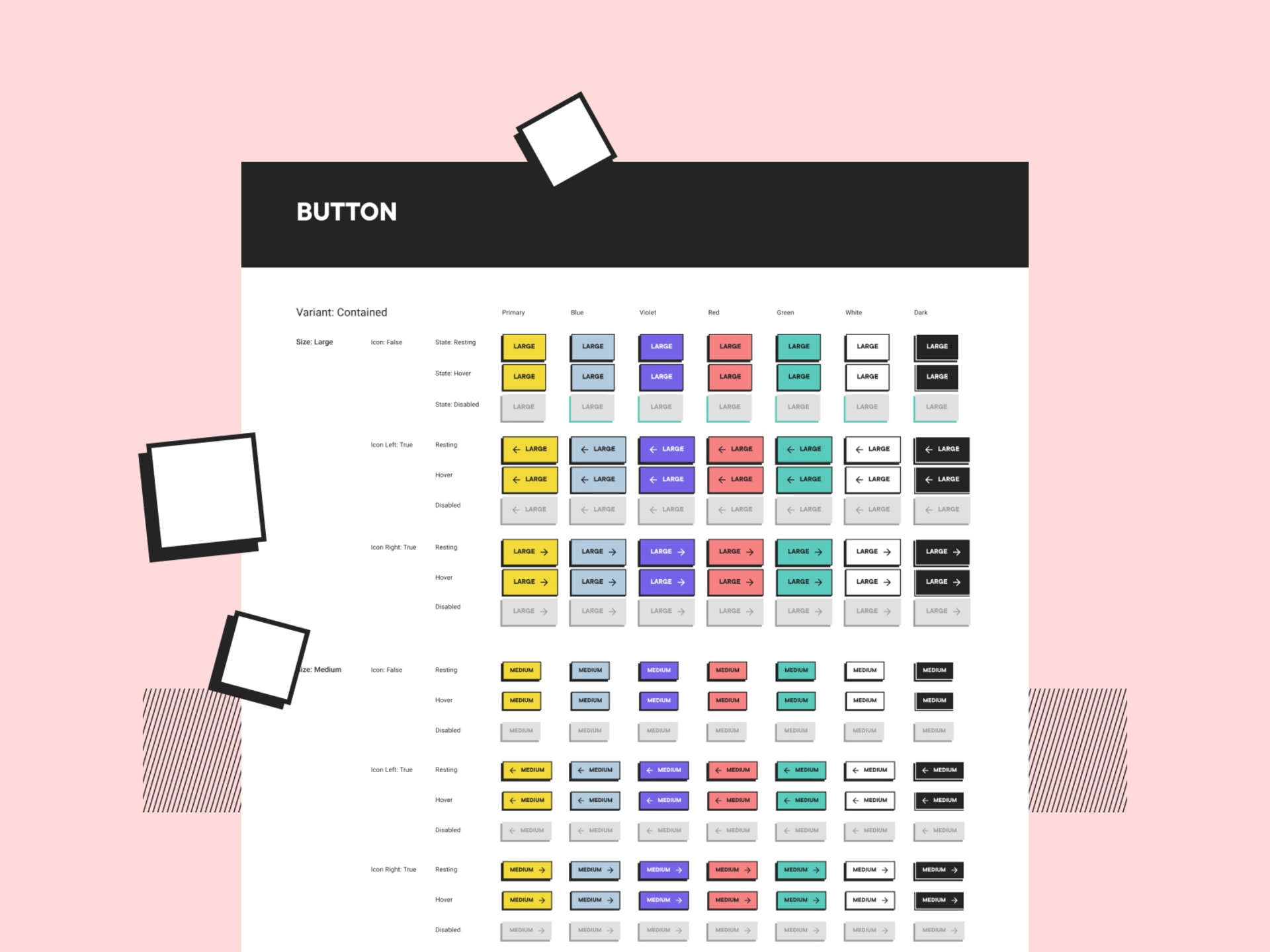
The UI and UX Kit
Think about some typical UI components: inputs, buttons, context menus, and tooltips. For a start, you’d expect a design system to include all of these. After all, there’s no point handing your designers a blank piece of paper when you can give them these elements readymade in your house style.
Not only does this cut down on project time but it allows your designers and developers to spend more time and effort on the higher-level functions that make this specific product unique. In the same way, the UI kit should also include text styles, icons, cards, headers and footers… all your potentially reusable components, in fact.

As an example approach to creating a collection of reusable components, Brad Frost’s 2016 book “Atomic Design” used an analogy of atoms used to build molecules which, in turn are used to build organisms, and so on. You can start with the basic HTML elements (e.g. form labels, inputs, buttons… any smaller and they cease to be functional) then group those elements into small units (e.g. a search form) which are your smallest reusable components.
Then group the units to create larger components (such as adding your search form to a webpage header layout). Next step? Templates (and to continue the example, this step involves putting your header with search functionality into a reusable homepage design).
What you’re effectively doing here is giving the team a pre-developed wireframe (or partial wireframe) and that can save significant amounts of project time.
The Style Guide
If the UI and UX kit has all the parts you need (or at least, all the reusable parts you need) then the style guide part of your design is what tells you how and when to use them, including guidance on dimensions, alignment, size and resizing, fonts, text justification, etc. The style guide shows how the different component pieces are expected to behave when incorporated as part of the product design.
These are the standards mentioned above, telling your developers exactly what the different components are for and laying out the circumstances in which they can and should be used. While the UI and UX kit can and should be updated regularly, it’s the style guide that makes your design system a dynamic entity, ensuring that your use of the component parts evolves along with your business and user needs.
Business benefits of a design system
As should be obvious by now, creating and using a design system for your digital product development carries a raft of business benefits:
- Better teamworking – Your designers and developers don’t ‘waste’ time on project elements that have been done before. Instead they focus on exactly what you’re paying for: the creation of new design elements and coding for the unique aspects of the product. What’s more, the design system provides a common language for all project team members and stakeholders, enabling better communication for faster and more effective results.
- Consistent look and feel for users – A design system directly supports your brand by ensuring that your clients and customers have a consistent and familiar experience whenever they use your digital products and, by extension, interact with your brand.
- Resource-efficient design and development – Whether you’re starting a brand-new app or scaling an existing platform for a new market, a design system effectively ‘automates’ the process where possible, allowing you to build with less resource expenditure.
- Faster development – Get your prototypes and MVPs built and tested quicker; and get your product to user and the market faster. Furthermore, the design system supports consistent future development of the same product; for example, when adding new features in response to user demand you can draw on the same UI and UX kit and components, knowing that they will be compatible.
- Less errors – The common language and perspective that comes from a design system means fewer misunderstandings between designers and developers, and clients and stakeholders. Furthermore, using components improves and simplifies automated tests.
- Time-efficient – Once again: working with design system components speeds up the design and development processes, making space for activities dedicated to the product itself, like research and data analysis. Simply speaking, the time saved thanks to a design system can be dedicated to other aspects of the app’s development and its improvement.
Design system checklist
When creating your first design system, it can be extended later. To begin with, focus on the following areas:
Check the visuals of your current designs – Chances are, you already have some established design protocols. Even if that’s not what you call them, there are elements of your current designs and branding that you want your digital products to demonstrate:
- Color – primary colors, tints and shades that you want your designers to use.
- Typography – fonts for headings, body text and code.
- Size and spacing – consider how the visuals will look on a variety of devices and operating systems.
- Images – illustrations, icons, photographs.
- UI library – Moving on from the visual appearance of your current designs, now collect the actual UI components that are in use (and that you want to keep!); the buttons, forms, etc.
- Documentation and standards – For each component, clearly state what it is, its purpose, and when it should be used; including the circumstances in which that use can be varied or changed.
Design system vs. style guide vs. component library
Many businesses might say (and believe) that they use a design system for their digital products but really they just have a collection of reusable elements that fit their branding. That’s fine.
That’s actually very, very useful and will probably give them many of the above benefits to some degree. But as is probably clear by now, that’s not a design system. That’s a component library.
The key difference is the style guide. To create a product that is more than a simple assembly of standard pieces, you need the standards and guidance that clearly indicates when to use them (and when not).
By factoring into the design process not just the what but also the why, your product will be a much closer fit to your user and business needs which is what ultimately differentiates the generic products that fill the market from the unique product (and user experience) that leads it.
Building your own style guide is not the end of the effort. Quite the opposite - it’s one of the first steps in creating a design system. To wrap things up:
- The component library is a collection of reusable components, ready to use during the design and development processes.
- The style guide is a set of rules that helps designers to understand how the components should be used to fulfill the goals.
- A design system includes components, style guides, documentation and all the rules that define how the product should be developed.

Design system - engaging turbo mode
Yes, design systems result in products that are part of an overall familiar and consistent ‘branded’ experience for the user. But on a practical level, creating and using a design system reduces the number of design decisions that must be taken in a project. This means your team can devote more time to those product features and details that make it stand out in the marketplace. A design system is an effective method of truly placing both users and stakeholders at the heart of your digital product designs. Sounds like a win-win situation!
Share this article: