Planet Escape
Responsive trip catalogue
Interface Design Architecture, Wireframes, Graphic Design, Implementation, PHP5, HTML5, Symfony 2.6

Tailor-made travel to the exotic far. We believe that a successful journey can be created only by specialists who are themselves deeply know the offered place.
We created the app for the travelers. We believe that a successful journey can be created only by specialists who are themselves deeply know the offered place. We change the image of the travel company into the very huge basket of the interesting destinations and offers to travel. Enjoy with us.

What
We change the travel agency into the different dimension
We helped the travel agency to change the image. Now they can help their customers to move into a different dimension of reality. They realize their dreams of exotic travel thanks to huge offers and also Premium package. This all gives us great satisfaction.
To change the old image
Create new image
with UX & UI app rebuild

Main challenge:
Building a new, professional visual brand

Distant & exotic travels
Discovering the world can be exciting
Many directions and inspirations - all in one place
2
website + blog
we've built siblings product

4/30
huge database
unique offers referenced on 4 continents and 30 countries
9
categories
each category connected with the offer
12
months
special destination prepared for the proper period
An extensive compendium of knowledge and inspiration
Variety of the possibilities and the bucket of knowledge
We put emphasis on authenticity and getting to know the local culture. On the website there are many travel destinations. To clarify and help in navigation, we created special categories for them.


Private paradise in the exclusive offers
The pure essence of luxury at its best
Exclusive offer for the most demanding customers who like to travel a very high standard. You will find here unique hotels in the world, which in itself could be a destination. All of them have their very nature, they are intimate, beautifully situated, indecorated with great taste.


Unlimited number of the best destination
With intuitive search engine listings
Search is the heart of this site. We made sure that the user always find the best deal. That's why there is always result. We focused much on FILTRATION and it worked out. There is always positive result, without reloading the page.


All about travel dreams in one inspiring blog
Travel inspiration, advice and reports of journeys
We created the second product. On the blog you can find the all interesting tips, inspirations and stories. You can explore places on map and find the related description on the map (all information are connected with the location). Furthermore, you can also navigate by categories and tags.
Goals achieved:
New image: professional & high standard of service
Design process
How we've built the huge application
We've built two huge products in regard to our standards and processes. At the beginning we've worked with the client together so close, that we created one scrum team together.
We worked on very huge application, so the architecture was very complicated. In addition, we placed a color code for each subgroup (range, country etc.).
In crafting the readability grouped specific pages and pointed functional elements appearing on views (sidebar, anchor, tabs). Thanks to this, the division of the elements is clear and logical.
Information architecture
35 views
that's the amount of all
pages included in the app

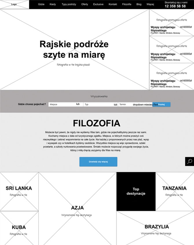
Wireframes
Wireframes are always the part of our design process. We create the sketch for the main devices: desktop, tablet and smartphone. This is a good basis for the graphic project.

Moodboards
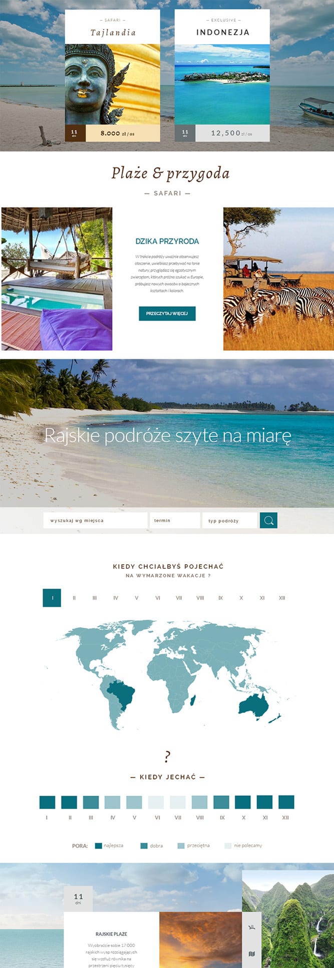
The idea was to build a refresh brand image based on the current corporate materials - typography, color palette and so on. The first proposition is very elegant. Two types of offers have been made on the division of color, appropriate selection of the proportions and typos. In the second version we decided to rely on sharp compositions simple geometric forms (tile system) - a modern application - to further emphasize the style.

1 release
Client + Boldare
client + 1 PO + DEV TEAM + SM
2 release
1 common team
1 PO (client)* + 1 BO + DEV TEAM
*Our success: the customer has become a part of the scrum team!
806
commits
191
closed pull requests
Technology
We've built complexed search travel offers
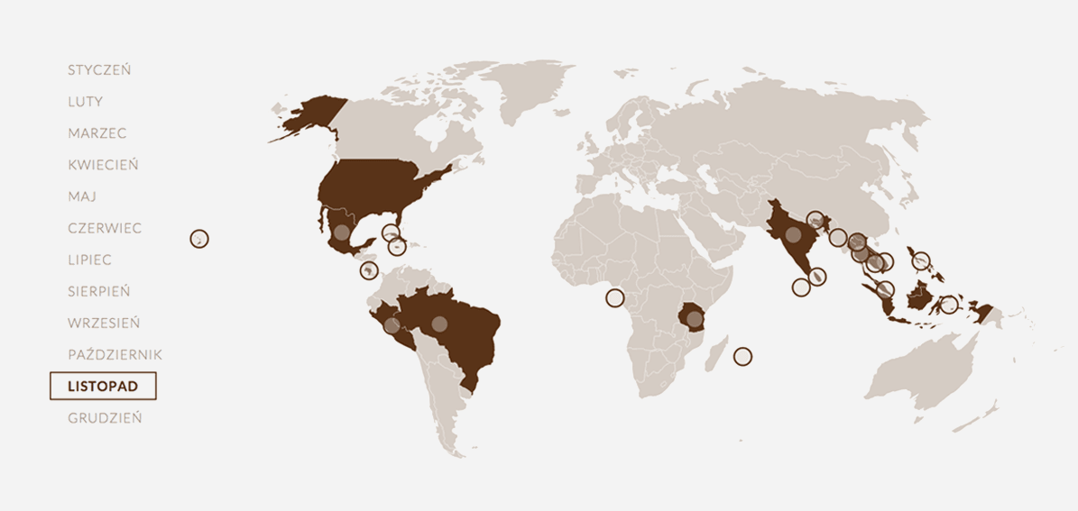
Main Square goal was to show the diversity of tenders. Next to the "ordinary" search engine we created the interactive maps. Now the users can find the recommended location connected with the seasons. Thank that the users can choose the perfect destination!

Javascript library
For manipulating documents based on data
- it helps us to create the interactive maps
- maps helps to find the best direction to travel

Sass

CSS3

jQuery

