Blog Software Development How data visualization influences user experience in digital products: three use cases
How data visualization influences user experience in digital products: three use cases
Businesses rely on data almost entirely. From e-commerce to the renewable energy sector, properly gathered and interpreted information helps businesses to make decisions. Data visualization helps to transform endless datasets and spreadsheets into easy to understand graphs that give value from the first look. In this article, we will present some of our products based on data visualization and how they bring value to both B2B and B2C users.

Table of contents
Visualizing energy for a green energy company
One of our most fruitful partnerships is a collaboration with a German green energy company. Since 2018, we have worked together to provide them with digital products that bring value to their customers. One of the biggest business challenges that they had initially was to digitize their services in order to provide better user experience to their customers.
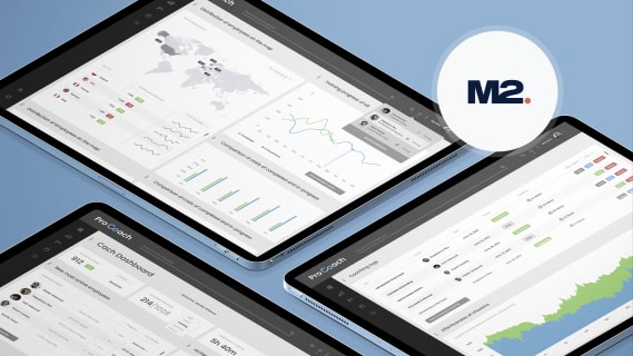
We are responsible for creating one of the core applications of this client’s portfolio - The Portal. It’s a web and mobile application dedicated to the end customer using the company’s products, batteries and photovoltaics installations. It’s an information hub that gathers all the data coming from the entire installation connected to the building and displays it with easy to understand visualizations.
Shortly after the application was released we noticed that nearly 80% of users were using mainly one screen. It displayed a visualization that showed the live flow of energy production and consumption between the battery and the community of users; i.e the other customers in the grid. From the user perspective, it was the most important screen.
At first glance, the mechanism that presents the data is easy - the application collects data coming from the customer’s energy network and presents it in a simple visualization. But soon we discovered that from time to time, the app was displaying unrealistic results that could confuse users.
After a short investigation and with help of the client company’s engineering team, we realized that due to hardware limitations the unprocessed data we were gathering from the system would mislead customers in very specific and rare situations. We decided to solve this issue once and for all, bearing in mind that user satisfaction is one of the most important factors for our client.

We created a new solution having two main goals in mind: to show the data as accurately as it is possible and be honest with the users. After the code refactor we improved the model that calculates the data. Instead of blindly trusting data coming from hardware, we decided to simulate the results and adjust our model to display the most realistic results. Now with an accuracy up to 1 watt, the app shows detailed information. When, due to local circumstances and hardware limitations, the app can’t display accurate data, we decided to simply inform users of the situation. Such situations last usually for no longer than a couple of seconds.
The data collected through the app is also accessible via the custom CRM suite we developed for the company. The data, enriched with an extra set of information inaccessible for the end user (like battery temperature) is available to the company’s technical support and can be used to run online diagnostics. Thanks to that process, initial investigations of any problem and potential solutions can be carried out without visiting the customer’s house.
The tech stack of both products includes: React Native; typescript; optimistic UI; and our team created a design system and dedicated library based on canvas.

Using data to improve local business for a business development company
Data can play an important role in stimulating local businesses. For example, the public platform we made for a government-owned business development company in the MENA region, helps users to visualize data in order to make better decisions about their businesses. As a result, the platform is a powerful tool that can help businesses to stimulate local economies.
This government-funded platform helps the country’s business owners to make better decisions. The web app is available for everyone and allows users to browse information regarding the demographics, statistics and economic situation in particular regions and cities. Data is gathered by the local authorities and then presented on the platform through two main applications.
One of the possible user cases is when someone wants to start a new business or open a new branch of an existing one. Using the platform, business owners can see the unemployment structure, the number and type of schools in the city. Using this kind of data, they can make decisions based on the official, governmental data and make the start a little bit easier.
One of the most popular use cases is when a restaurant owner (or an owner to be!) looks for the best place to open a new branch of his/her business. Using a Google-based maps app, the owner can see the number of restaurants in a specific city district. If the competition is too heavy it’s easy to check adjacent neighborhoods in search for the best location.
We created the entire platform from scratch. Data visualization is presented mainly on custom Google Maps and diagrams. Users can browse through various data sets and combine them according to their needs.
This case is one of our favorites, as the team dedicated to working on that product has to be skilled in designing according to Arabic standards. At Boldare we have several years of experience in working with Arabic clients and creating products for the Gulf Area.
The tech stack we use is: PHP, JavaScript, jQuery, React.js and d3.js for data visualization.

A Wikipedia for a data visualization
This third client is an online community that gathers together data visualization creators and lets them share their work with others. This case is different from the others, as we were not responsible for creating the visualizations themselves. But we had to create an environment that would support professionals and enthusiasts to easily add and present their work and build their professional portfolio. One of the things we wanted to make sure users could do was upload visualizations easily, no matter how they were made (using code or graphic design).
During the eight-week development process we managed to create a user-tested MVP - a “data visualization Wikipedia ‘’ as the co-founders referred to the platform.
You can read the entire story about our collaboration with the community founders in a detailed but brief case study: From Instagram to a data visualization platform.
Data visualization in apps - a key to better user experience
There are a wide variety of digital products that use data visualization to great effect. By representing data in a visual format, these products are able to communicate complex information in an accessible and user-friendly way. From news apps that provide up-to-the-minute data on the latest stories, to data analytics platforms that help businesses make sense of their information, data visualization is proving to be a powerful tool across a range of different applications. As we move into an increasingly data-driven world, it is likely that data visualization will continue to play an important role in the way we interact with digital products.
Share this article: