Digital product design trends for 2022 and beyond
Did you know that, as of January 2021, nearly 60% (source) of the world’s population were active internet users? This goes to show that ‘digital’ is increasingly becoming a part of our reality. It’s hard to imagine living without access to our favorite digital services and products. That being said, it’s important to realize that the competition for such a huge global audience is vast. To grab users’ attention and build loyalty, designers need to stay on top of the most innovative digital product design ideas. As the new year begins, here are the top digital product ideas that will help you stay at the forefront of design and great UX in 2022.

Table of contents
Product design trends that will dominate in 2022
1. Continuous discovery
Traditionally, product discovery occurs right at the start of any project. It’s that moment when you can start validating your product design choices. And that’s essential for designing the best product possible – but it shouldn’t end there.
Continuous discovery focuses on an ongoing, user-centric process that connects your design team with the people who use your product. It’s about taking a collaborative approach. Rather than a single research phase, you’ll want your designers committing to smaller, continual, more frequent user research focused on specific elements of the page app under development. This allows you to continue refining the product without impacting your project timeline.
As a result, your product becomes more aligned with user needs. You should also see improved efficiency, since continuous discovery won’t necessitate huge changes to every aspect of the product all in one go.
It’s also useful since it shows that you genuinely care about and listen to the opinions of your users.

2. More sustainability
When you think of sustainability, chances are you conjure up images of physical products: recycled goods or planting two trees for each one a company chops down. But digital products and services are just as susceptible to unsustainable practices as physical developments.
The fact is, when it comes to green credentials, the online world has almost none – at least right now. Because it’s all running on electricity, data transfer creates a massive amount of carbon emissions. According to the BBC (source), the internet accounts for almost 4% of global carbon emissions. That’s about as good for the environment as burning tires in a national forest just for fun.
So, what does that mean for companies looking to implement more sustainable practices?
One of the best places to start is to introduce ‘weightless content’. In other words, you want to cut down on the amount of data transferred through data compression, optimizing page elements, and loading content only when the user requests it. It’s a balancing act, really, between what’s great for the environment, your brand, and the performance of your product.
Naturally, this can be tied into your new minimalist and accessible design approach.
3. Accessibility & availability
Accessibility is more than just a marketing buzzword; accessible design has real, tangible benefits for you and your users. It’s all about putting the focus on ensuring that everyone can use your website or app, regardless of the device they’re on or the disabilities they may have.
The benefits are three-fold: you show how you value all users, you can increase your user share, and you create great user experiences for everyone.
If you want to make sure you’re genuinely offering accessible design, consider:
- Device limitations. Think about how users are accessing your product. It should perform great on mobiles, desktops, and tablets. Also, take into account internet speed – not all users will be using a fast Wi-Fi connection. If your product demands high-speed Internet and top-of-the-line devices, you’re potentially cutting off a significant market share.
- User limitations. Your UI/UX team should be working on solutions that make your product accessible to those with physical or mental disabilities. This might mean increasing the size of elements and changing the contrast so they’re not small, fiddly, frustrating, and unclickable to someone with a motor impairment.
Arguably, one of the most common examples of accessible design is subtitling videos. The inclusion of these can broaden the audience for your video, whether they’re hearing-impaired or just don’t want to turn the sound up while they browse. Color-blind mode (source) is another popular accessible product design choice, with apps, sites, and video games all adding the function to switch to a more easily-read color scheme.
It’s worth consulting the Web Content Accessibility Guidelines (source). This guide explores key considerations in accessible product design trends, and offers loads of inspiring product ideas.

4. Voice user interface
Next, comes voice user interface (VUI). Back in 2019, 91% of brands (source) were already investing in voice-based product designs. The popularity of VUI continues to rise since – particularly in the e-commerce sphere - giants like Walmart are now offering voice-ordering. Speak a single sentence and your purchase will be winging its way to you in seconds.
Thanks to the rise in digital assistants like Siri and Alexa, and Google and Amazon’s drive to put a smart speaker into every home, users are not just familiar but comfortable with using voice interactions. And it’s not hard to understand why – it’s truly convenient. Why pick up your phone, open an app, type out a question, or search for a product to buy when you can just ask your device to do it for you?
There’s no denying that VUI does require a change of mindset. Most firms are highly focused on the visual UI elements – how does it look and how does a user get from A to B. That’s totally understandable and will remain the priority for as long as we predominantly use screens to interact. But look to the future and make space for new ways for users to interact with your products. It’s also a great way to make your product even more accessible, so there’s that, too.

5. Scrollytelling
One of the year’s biggest product design trends is set to be scrollytelling (no, that isn’t a typo; it’s a really neat design technique!).
Scrollytelling combines a little bit of storytelling with a little bit of scrolling. And it makes for a super-memorable and simple user experience. It’s a way to display information bit by bit, without overwhelming visitors to your site. Or, worse, boring them.
Our product page is a very good example of this. With each scroll, images, text, and fonts all change, creating an exciting journey that boosts engagement. Like a good book or an unmissable movie, users keep scrolling because they want to know what happens next.
Think about the stories that will most engage your users – and how best to present these digital product ideas on the page.
6. Minimalism
With users spending more and more time staring at screens, minimalism is coming back. It’s all a far cry from the early days of the internet, with flashing banners, multi-colored backgrounds, and the absolute chaos of trying to figure out where to look and what to look at.
Probably the most famous example of a minimalist website is the Google homepage. You won’t find an ounce of fat on it. Just a focus on the brand (through the novel Google Doodles) and a search bar showing a clear user action.
In 2022, you’ll find more companies are taking the minimalist approach for apps and websites – moving away from bright, distracting images and fonts to help reduce eye fatigue. That doesn’t mean stripping out all personality and design from the page; it’s about deploying only the most useful, integral elements to increase engagement and make the product easier to use.
You can see how we at Boldare understand minimalism here.

7. Humanization of UX
It’s COVID’s fault, of course.
After two years of remote working, isolation, and lockdowns, users have lost a big part of their lives – missing friends and relatives, unable to share experiences and emotions with the people that matter most to them. And this is absolutely going to change the user experience for many.
As we emerge from the pandemic, we can see a serious opportunity for savvy companies: the chance to nurture strong, genuine relationships with users who need to socialize.
A core part of this will be humanizing your user experience.
Users don’t want to feel like they’re ‘just another number’. They want to feel valued, heard, and seen. Nor do they want to converse or collaborate with what feels like a ‘robot’. They appreciate more conversational communication that, at the very least, creates the illusion of a more human experience.
One of the first steps is to think of your product, whether it’s an app or a website or anything in between, as a real person. If it were brought to life right now, what would it look like, how would it talk, what tone and language would it use? What is its name? There’s a reason Alexa is called Alexa, and it’s not just about alliteration with ‘Amazon’. It’s because when you ask her to play a song or find a recipe, it feels more natural, more empathetic. More human.
While you’re designing the user experience, avoid stock images and generic graphics. They could apply to almost any app or site, stripping out any personality from your otherwise brilliantly crafted product.
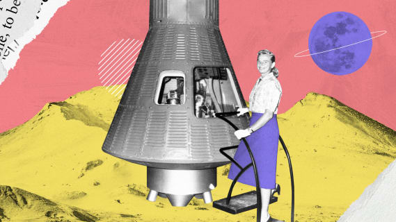
8. Old & new (interface)
After an unpredictable couple of years, now is the ideal time to blend the old and the new across your user interface.
Take inspiration for product design from the past, and apply it to new tech. Retro design, also known as nostalgic design, stirs strong positive emotions in users – particularly older ones – creating a connection to a ‘better time’. A really great example of this is the typeface and illustrations currently used by Burger King (source), which evoke the feel-good, carefree vibes of the 1970s.
Summary
Product design trends in 2022 show a clear focus on creating simple, smart experiences for all users – whatever their circumstances, whatever device they use. With your creativity and mastery, your design team has the power to craft meaningful moments, from intuitive and easy-to-use interfaces to sustainable solutions that impact everyone. Ultimately, while inspiring product design ideas come and go, one thing remains the same – it’s all about the user, just like it always was, and just like it always should be.
Share this article: