

Quality Assurance for better user experience in product development
Depending on product maturity, there are parts of the QA process that are of more or less importance at specific development stages. When the product is in an early stage and there is already testing included in the development, there’s more focus on catching bugs and providing functionality that actually works. But as the product grows and complexity increases, we aim to provide better quality for the end user. In this article, using a simple example, I will try to emphasize the importance of QA for a final end user experience.

Table of contents
The cost of badly designed UX
Before we dig into details, let’s see why it’s worth investing in improving the quality of the user experience. As I mentioned above, there’s nothing wrong with focusing just on catching bugs and providing a working product. By improving the user experience, the product not only gains more engaged and happier users, it can also impact business value.
“Amazon found that each 100ms delay cost them over a billion dollars in sales.
Google found that 1/3 of this hit remained after decreasing loading times.” (source)
The scale is important here. If your app is used by thousands of people, a high churn rate caused by malfunctions and small but annoying flaws can cost you a fortune. Saving on your budget by avoiding important improvements not only creates technical debt, but can change your customers’ decisions regarding your product.
Now, let’s dive into some practical examples of QA for better UX.
How can Quality Assurance improve UX and UI?
Imagine that you have a piece of software where the user is asked to input some data into fields.
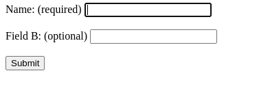
For now let’s just skip the styling and focus on behavior. Let’s assume that the form is working as intended. There are no errors, it does what it was meant to do.
What would a good tester notice after testing such basic functionality (so-called ‘happy paths’)? There’s no visual difference between the ‘required’ and the ‘optional’ field, apart from the text in the brackets. The UI should provide the user with enough information so there’s no need to read and think, but enough to use it. That’s what we call ‘intuitive UI’ – you can use intuition instead of understanding.
My ‘rule of thumb’ is to minimize the number of things you require from the user, especially avoid forcing them to read and understand; also eliminate options, paths and behaviors that can lead to errors or undesired results. The UI should help the user take the actions we expect them to take. It should somehow suggest how to use the product or specific functionality.
The UI above is misleading the user. At first glance (without reading) users cannot spot the difference between those two fields.
So let’s fix it:

This one is much better! When we take a first look, we can easily distinguish between the ‘required’ and the ‘optional’ field. Also, it uses one of the most common conventions: using a red asterisk as the mark of a ‘required’ field. Of course, we can use something different – e.g. a red background on input:

But remember, each novel or less common solution can result in the user misunderstanding the intention and eventually being frustrated. If you use popular conventions and standards – those that users have probably seen or encountered somewhere else – it will be much easier for them to understand and use the product or functionality as you would expect of them.
A great example of this rule is… doors. Basically, we use doors everywhere in our daily life. And of course, we have different types – hinged doors, sliding doors and even revolving ones. Some of them have door handles and some of them have knobs, and some of them don’t have either. Even when you enter a new building you’ve never been inside before, you don’t wonder ‘How do I get through this door?’. You just use the door.

Back to our fixed example – what else can we improve? It is a good rule to eliminate options that can lead to misleading behavior. In our example, we can make the button inactive until the user types something into the form.
That would eliminate a situation when the user clicks on the button before providing the required data and gets an error message (Remember to always provide the user with a descriptive error message that says what went wrong and how to fix it!). When testing the product, the QA tester should be a sort of advocate on the user’s behalf, fighting for an easy-to-use product.
Consistency matters
This is also an issue that is easy to overlook and ignore. Do different parts of a product with similar functionality work in the same way? Why do some apps demand that the user upload files to a website by drag & drop behavior and in a completely different part it expects them to click on a button to select files for uploading? Why in one place do users have to click on a ‘Save’ button to save their settings and in another changes are automatically saved with no need for a button at all?
These little inconsistencies are not crucial but can result in confusion. A good tester should not overlook such details and instead point them out, saying ‘Hey! If I was the user, I wouldn’t know why I should do this one way here and another there!’. Of course, sometimes those decisions are made for a reason.
If it is a good reason, then a tester should advocate placing information in the documentation explaining why such a decision was made, and ask how we can inform the user so they are aware of the different behavior required.
Q stands for Quality
QA testers should never be satisfied with ‘good enough’ solutions. ‘Working’ is not an acceptable status for a product anymore. Especially when developers constantly check if the code is working while writing it, and when they run it after writing. If it was just about the product ‘working’ then probably the QA job wouldn’t be needed. Literally everyone can notice when something is notworking. So, a QA engineer should go far beyond that:
- Why is it not working?
- How should it work?
- Or if it is working now – how can it work better?
A good QA tester should have knowledge of technology, UI/UX, processes and should constantly work on their own approach and tools. A good knowledge of the product they are working on and its business goals is extremely helpful - the more a QA expert knows, the better for the product. Spending time learning how it works and who the customers are also helps a lot. And remember: the ‘Q’ stands for quality. If you want to assure it, you have to not only know the theory but also practice that quality yourself.
Share this article: