The ultimate guide to successful digital product design
What does it take to achieve successful product design? It comes down not only to having an expert team, but also using the best tools and following the right product design process. In this guide, we’ll tell you everything you need to know to start your design project on the right foot. We’ll begin by explaining the principles and steps involved in digital design, and then take you all the way through to choosing the right tools.
Table of contents
Defining the digital product design process
You may have heard the phrase ‘product design process’ thrown around, as if a single, unified process were in place at every company involved in the design of a product.
First, let’s start with the basics: What is product design and the product design process?
The product design development process comprises every step you and your team take to bring a product to life – from that initial idea to the product launch (and all your continued testing and refinement afterwards).
What that process looks like will differ from company to company and from product to product. There’s no predetermined roadmap, where every bump and curve of the road is accounted for. For example, your company may thrive on repeated, regular testing, while others don’t. You may draw on the different strengths of cross-functional teams to craft your prototypes, or you may use one UX guy who can do it all alone.
There’s no right or wrong process for product design. It’s about using what works for your company.But there are key components of every great product design process. The art is how you execute them to build the product that attracts and retains your users.
The product vision
The product vision isn’t just that first idea, the hastily doodled concept, the brainwave that strikes in the middle of the night. It’s the clear outlines of what you’re building, so everyone working on it understands what they’re working towards.
By outlining the product vision at the earliest possible stage of the product design process, everyone understands their role, preventing inefficient back-and-forths and the dreaded, resource-draining mission creep.
Your ‘vision’ is best served by knowing, from the outset, which users you’re targeting, what they want, and why your solution is the answer to all their problems.
Product research
You need to understand where your product fits into the market. What’s the USP that makes your design better than the rest? What needs can you serve that others don’t, can’t, or won’t? Without understanding the current market and the space your competitors occupy within it, it’s impossible to know if the juice is worth the squeeze.
To prevent wasting time and resources on an unviable idea, product research is essential. That doesn’t just mean reviewing rival apps and sites. You’ll want to discover what users think (and need), too, because that data will help you create and refine the right product for your audience. Interviews, field studies, and surveys are all excellent ways to obtain this valuable information.
Analysis
Armed with your product design data, the next step in the process is to analyze the data to make it actionable.
One effective way to visualize that information is through user personas. Think of a user persona as a broad-stroke picture of your average users – from demographics to socio-economic status. So, for instance, your website might skew towards older users. That means your designs will need to account for font sizing and clear call-to-actions. Personas can help you understand what your product needs to look like, and how it functions to appeal to the right users.
Be honest when creating your personas. Hard, relevant data should inform what real users actually want – not what you want them to want. Your product will be stronger this way. Empathy maps are also useful. These help you see what users say, think, and feel about your product, compared to your competitors. You can then adapt your design as necessary.

Visualization and ideation
Keep hold of all that data. You’ll need it – not just to aid the direction of your design, but to keep the process on track.
User journey mapping is a great technique for doing this. It lets you see the user flow – the way they interact with your website or app. Every action a user takes tells you a little bit more about how they use your product, so you can build an even more engaging experience.
Creating user stories (user story mapping) is another method. Popular among agile businesses, these add context to your product from the user’s point of view. User stories are quick, simple pieces that detail the user, the intended action, and their expectations.
Designing the product properly
This is where the fun begins. After all that essential research, your team can now start creating something tangible that really appeals to users. It’s best to begin with design specs, so designers can build low-fidelity wireframes and high-fidelity prototypes that are correctly targeted to the right users.
Testing and validating concepts
Once you have a high-fidelity concept in place – one that looks and functions just like the real thing – it’s time to see what users really think. This is the stage in the design of a product process where you evaluate the accuracy of your (data-driven) assumptions through usability testing, which gives highly targeted users controlled access to the product, and guerilla testing, which runs across a larger cross-section of the market.
After the launch
The product is released – finally. But the product design process doesn’t stop there.
Digital products can’t stand still. The market is too fast-paced, the user base too demanding for that. Think how radically your favorite website has evolved over the years – altering to meet modern user needs. With your own product, establish tangible metrics for success, for example, the number of downloads or time on page. Then conduct feedback from the most relevant users. Continue refining the product through A/B testing to boost future iterations.

By following the basic product design process – adapting it to meet your own needs and objectives – it’s time to think about who will make that innovative vision an unmissable reality.
Read more about the digital product design process.
Introducing a digital product designer
Now that you know the answer to the question ’what is product design?’ and what it looks like at various stages, let’s take a closer look at the product designer’s role.
A product designer is a problem-solver, responsible for meeting user needs. And they’ll draw on every team member, tool, and database to do it. Like the design process itself, the exact role of the product designer will differ depending on your business. However, there are essential skills possessed by every product designer.

The concept
Data is the product designer’s best friend. With it, they can begin visualizing the end product through user personas, storyboards, challenges (for users), and opportunities (for you). It’s a role that emphasizes ‘big picture’ thinking across the UI/UX spectrum.
The journey
A product designer must make sense of the user flow. A good flow is frictionless and easy to navigate. A user needs to ‘succeed’ in reaching their target – whether it’s accessing their account info or jumping straight into a mobile game. Think about how effortless the buying process is on Amazon. Nothing stands in your way (except, maybe, cookie notifications).

Source: Amazon (source)
The wireframe
A wireframe is a basic way to visualize the product, mostly for UI/UX purposes. Use yours as a launchpad to discuss the full design possibilities. This is your foundation, helping your designers work up a high-fidelity concept piece and developers lay the groundwork for a full application.
Explore how a digital product designer operates in our dedicated piece.
The principles behind designing a successful digital product
User-centricity
In today’s digital marketplace, the user comes first. Everything you create has to fulfill the ever-growing demands and expectations of the user. Imagine two websites with the same functionality – only, one takes a second or two longer to load. Which would you use?
Focus on creating products that understand:
- Who your target market is,
- What they really want (they = the target market),
- What problems they face,
- How you help overcome them (them = problems).
Refine your product accordingly, based on this understanding (and all the feedback and data you’re getting). Because if you don’t, others will.
Frictionless experience
We all recognize those digital experiences that place obstacles in our way. The unnecessary ‘give us your email’ form, the pop-ups, the obtuse menus that only make it harder to get to where we’re going. Product design – and user expectation – demands simplicity. Users want instant load times, easy navigation, and clear instructions. This builds on the user-centric mindset, creating experiences that just work. Simple as that.
Value before features
It’s oh-so-easy to succumb to the temptation of adding all-singing, all-dancing features. But is this a wise use of resources? And is this really what users want? Generally, the answer is no. Features won’t help a product stand out more than one that adds value to the digital experience.
Value is more important than an interesting feature that distracts from your core offering. The Google homepage is a great example. The focus is on providing value to the user. It’s easy to search the internet, distract yourself from the ‘real world’ through the Google Doodle, or access your Google services. With all that whitespace, Google could do so much more. But doing so would strip away the true value of the site and the service.
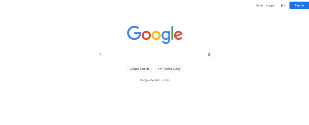
Source: Google (source)
Data-driven decisions
Gut feelings are great during the initial stages of product design. They’re this brilliant, creative spark that ignites ideas. But at some point, all visions have to meet reality head-on. For that reason, drawing on data is essential for creating a product that provides a meaningful experience.
Collect quantitative data – numerical and fact-based, like page visits – and qualitative data – characteristic and emotion-based. This will give you a far broader overview of how people use and respond to your product. Refine your offering based on this data. It’ll be worth it, to you and the user.
Design consistency and hierarchy
Consistency helps create a seamless user flow. When you visit a website and navigate through the pages, the font, icons, colors, and page layout remain the same. It doesn’t feel like you’re visiting one, two, or fifty-three different pages.
This is good from a branding perspective – users remember who provided that awesome digital experience. More importantly, consistency helps build intuitive experiences as users navigate your app or website. The search bar is always in the top-left corner, for example. A green tick always means responding in the affirmative. They don’t even need to think about it.
Visual hierarchy lets you focus the user’s attention on what matters most. There’s a reason call-to-action buttons are big and bold, and the menu icon is three small lines in the corner of the screen. Users recognize what the three lines indicate if they need it and so they’ll know what action you want them to take.
Explore more about the principles of product design.
Creating a successful digital product design strategy
Start with a clear vision
A clear vision helps you place resources where they’re most needed when it comes to the design of a product. Everyone involved in the project should know:
- What needs to be built,
- Why it needs to be built,
- Who it’s for,
- What success looks like.
Your vision should provide the solution that users are looking for – one that isn’t available anywhere else (and one that does what others can’t do).
Unite design and business goals
Ensure your design goals align with your business objectives. While still valuable, it’s less so creating a site that brilliantly informs users of something, while entirely neglecting to induce conversions, which is what the C-suite yearn to see. Take the Google homepage again – the design encourages a web search, so the company can display adverts to users at the next stage. If design goals aren’t in sync with business goals, it harms the existing product and builds a business case for new innovations down the line.
Agree on the problem
Everyone involved in the project needs to understand what problem users face. Without that, it’s nigh-on impossible to build a product that really caters to them. It’d be like building an immobile car. At this product discovery phase, draw on data to gain real-world insights – zero in on your users through focus groups, market research surveys, and interviews. This helps you see what they see, so everyone on the project can help craft the answer to those problems.
Test the experience
Now you have a good understanding of the user’s problem, you can begin working on the perfect solution – and, as that progresses, you’ll want to start assessing the user experience (UX). Is your website snappy and fast? Can users successfully navigate your app? Is it optimized for multiple devices?
During testing, seek out ways to improve the experience, explore the viability of proposed solutions, test its usability, and identify any other areas where you can add value to the user. Your user testing stage is about ironing out the kinks, so you can feel confident that your product meets their demands and expectations.

Differentiate from competitors
Your product isn’t the only one addressing users’ problems – but you need to make it the one that solves them best. For that, you need to find ways to stand out in the digital marketplace. This is your unique value proposition. It’s what you do that no-one else does.
During the design process, identify:
- What the competition is doing,
- What your product does better than the rest,
- Where your product can be improved,
- What opportunities the product presents.
Identify risks and issues
Identifying risks and possible issues is a vital part of any product design strategy. By getting them on your radar early, you can adequately prepare, and limit their detrimental impact on any project. Common risks to keeping a project on track include overrunning on costs, mission creep and schedule overruns because there are no milestones in place, and technical issues, such as a new technology or teams being unable to use existing tech.
Define success metrics
What does success look like? Without knowing this, it’s impossible to see just how well your design performs and where changes must be made. By placing tangible metrics, you can then refine to build the strongest possible product. For example, if you aim to limit cart abandonment in your ecomm shop, it provides a clear path of optimization, whether by tweaking the interface or radically changing usability.
Evolve the strategy
A product design strategy shouldn’t remain static – you know how fast the market (and user needs) change. Your strategy has to have built-in flexibility. You may find your product is insanely popular with a different target audience, for example. Or your biggest competitor unveils a game-changing feature. Is your product design team ready to adapt to that gear shift?
Build your own detailed product design strategy using our article.
3 product design mistakes you need to avoid
Keeping your design process on track is critical – you can’t let anything throw you off balance. To help you stay the course, we’ve drawn on first-hand experience to uncover the big three mistakes that can derail any project.
1. Feedback deficit
A mother doesn’t want to hear criticisms about her child, right? And designers and developers don’t want to hear poor feedback about that product they’ve been cooking up for months. But that feedback is essential – there’s no other way your team can improve a product that hits all the spots users want it to hit. It’s like learning to ride a bike.
Every tumble is feedback telling you how not to cycle, and how to succeed. In the digital space, feedback might show you need to add microcopy to direct an otherwise rudderless user to the right place. It’s a little thing you might’ve easily missed. But it can make or break the user experience.
2. Checkout errors
Imagine the disappointment when you’ve found the perfect product, only to find the design of the product stops you from actually buying it. Maybe a pop-up blocks the ‘Buy’ button, or there’s a technical gremlin gumming up the works. That’s really frustrating for a user who’s likely to never revisit your site – and it’s going to have a serious financial (not to mention reputational) impact on your business. Always try the checkout experience yourself, before the customers, to make sure everything works as it should.
3. No call-to-action hierarchy
Hierarchy is important in product design, because it lets you guide users to the places you want them to look and the actions you want them to take. A really common mistake sees apps and websites give call-to-action buttons priority over any other. So, you might desire one action (like ‘Buy now’), but the confusing hierarchy leaves users lost or has them click on a less important CTA. It should be clear what you want users to click or tap, even when your site features multiple CTAs. Use position, color, and size to focus the hierarchy with the primary CTA at the top.
To learn more about common digital design mistakes, refer to our dedicated article.
What product design tools are worth using?
Effective digital product design doesn’t come down just to creativity and your designers’ experience. It’s also important to equip them with the right software. Here are some of the ways the right tools will support your design project:
To facilitate remote work
A lot of businesses now favor remote work, but to work effectively from different places, it’s crucial to have access to the right tools. These will enable you to share your ideas, exchange information, and collaborate on projects the same way you did when you were office-based.
To increase productivity
If you opt for tools that not only integrate with your toolstack but also ones that your design team is already familiar with, you will significantly speed up their work. This will also help with making the design-development handoff more smooth. You’ll be able to easily share the design specifications and other vital information, which will reduce the possibility of design inconsistencies during development.
See Boldare’s Sprint Retrospective Tool!
To seamlessly integrate with your other tools
Most of the top digital product design tools integrate with tens, if not hundreds of other types of B2B software. This saves designers a ton of time, otherwise spent on manual import/exports of data across tools, or jumping between them.
For instance, let’s assume that your UX designers launched a UX survey among users. By integrating the survey software with your communicator, such as Slack, they’ll be immediately notified of any incoming responses. The same goes for sharing designs. Your team could integrate your project management tool with your design software, and automatically embed designs into knowledge base articles or task tickets. And these are just two of the many use cases!
With these advantages in mind, you might be wondering – ‘how do I make the best choice?’ The market is saturated with tens of digital design tools, but here are a few suggestions of our own, tried-and-tested design tool stack:
For UX research:
- Optimal Sort
- Look Back
For design:
- Whimsical
- Figma
- Google Material Design
- The Noun Project
- Adobe Illustrator
For effective communication & project management:
- Notion
- Mural
For analytics:
- HotJar
- Google Analytics
We discuss each of these and what makes them great in a dedicated article on product design tools.
Digital product design trends to watch out for in 2022
Accessibility
The digital space is for everyone. The products that succeed in 2022 and beyond are the ones that appeal to (and genuinely value) a broad user base – it doesn’t matter what their experience level is, what devices they use, or what disabilities they may have (See also: How to build an accessible app for people with disabilities?)

Let’s start with device limitations. With billions of us online, users are accessing your product across tons of different devices. Mobile or desktop; iPhones or Android; super-fast broadband or dial-up (yes, seriously). Factor in how users are accessing the product and tailor the experience accordingly. If your product is Apple-only, or demands a high-end graphics card, you’re cutting off a swathe of other users.
User limitations are related to the physical or mental disabilities some may face. A common example in the design of a product is including a color-blind mode for those who need it. Or subtitles in a video. If you’re targeting older users, it may mean you need to up the font size in the product to allow for clearer navigation.
Scrollytelling
Scrollytelling is a really engaging product design technique that adds storytelling to the (frankly otherwise repetitive) action of scrolling down a page. As users scroll, they don’t just see old text disappear at the top of the screen and new text jump up from the bottom. Instead, every scroll changes the content of the page itself. It’s a bit like watching a movie or reading a book that’s unputdownable – users can’t help but scroll to find out what they’ll see or learn or do next. This design style helps you feed users relevant information without overwhelming them or distracting them with actions elsewhere on the page.
Minimalism
Keep it simple. The online experience is already hectic enough, with every page on every site fighting to keep our attention. Look at me, screams on the headline. Do this, cries the call-to-action button. And all the space in between is designed to catch the user’s attention. And that’s exactly why minimalist designs are on the up. An ocean of calm among the chaotic fatigue of the digital world.
Expect to see digital products favor uncomplicated, streamlined designs that don’t distract users from what matters to them. Without stripping away their own personality, the most artful among them focus on core features to increase engagement while simplifying use.
UX humanization
Today’s users don’t just seek a relevant online experience. They want a relatable one. 2022’s most successful products are building empathetic relationships through user experience.
No one wants to interact with a robot. They want to interact with someone who feels like a friend. Because a friend is someone who values them, understands them, and cares about what they want.
Start by imagining your product as a person. How does it interact with users? What tone and words should it use? Your answers should chime with your users. If you’re offering, say, legal services, then your users might want a professional but caring experience. If you’re a rebellious start-up, you may choose a more relaxed language.
Find whatever works for you, your objectives, and the people using your product. Build a personality that feels real. Even an AI chatbot can sound human, after all. And these are just a few things coming to product design this year. Discover even more exciting UX design trends in our guide.
Best practices for creating user-friendly websites
Ensure responsive design
We’re not talking ‘responsive’ in mobile-first terms. The need for a website that displays pixel-perfect across multiple devices and differently sized screens is well-understood. Especially given that users are rapidly choosing to browse and shop on phones over desktops.
What we’re talking about is a website that responds. Quickly. Users expect instant results – or, at the least, acknowledgement that something is happening. Your site can’t afford delays. Tapping a button multiple times isn’t an experience. It’s just frustrating. They won’t be able to hit the ‘Back’ button fast enough (at least twice as fast as it’s taking for this unresponsive page to load).
Include high-res visuals
There’s a hard-wired reason for the popularity of sites like YouTube, Instagram, and Pinterest. We’re drawn to visuals. It’s built into our DNA. So, use high-quality images to capture the user’s attention and showcase yourself. Whether you’re an ecommerce website or an English language course provider, big and attractive visuals will help you better position your brand.
Balance text and visuals
Ok, so users respond well to great visuals. But don’t make your website one big picture. Find the perfect balance between text and images that guides and informs users. Choose the best medium to accentuate the flow (and test your thoughts on users, to see which they prefer).
Maintain accessibility
Accessibility can sometimes fall by the wayside, shunted away by esthetic and functionality demands. Don’t allow this to happen. You’ll be able to reach a broader target audience by including accessible design features – is it worth turning users away when you can just include keyboard navigation assistance or alt text on images? It’s 100% possible to prioritize both accessibility and quality.
Place CTAs above the fold
You want users to hit that call-to-action button, so it should be front and center (ok, not literally, but it should be the first thing they see when they land on the page). Don’t hide it away – even if it takes a single scroll to find it, the site has already alienated a large section of the user base.
Simplify navigation
Moving around your website should be simple. Intuitive. Don’t make users have to think, even for a second, about where to go or what to do. Keep navigation consistent across pages. And keep it familiar, taking inspiration from other sites. Amazon all but defines the experience on every ecommerce site; all search engines have Google vibes. When we see the three lines in the corner, we know it’s the menu button.
Include testimonials
‘Word of mouth gets around,’ they say. Social proof is a powerful tool. Users love to hear how your solution solved someone else’s problem. Reviews and testimonials are an excellent way to offer convincing social proof to drive conversions, or meet any other objective, really. Make sure your site includes them somewhere in the design – whether that’s a full-page quote or a simple visual star rating.
Adopt more best practices in your design process by giving our dedicated article a read: Product page design.
Summary
The design of a product plays a major role when it comes to user experience. Nowadays, people get access to millions of apps, and they don’t have to accept poor design of a product – they can simply go with a competing solution.
To make sure that your digital product is a market success, be sure to first understand ‘what is product design.’ Secondly, make sure to follow the steps of the design process explained in this resource, and be sure to refer to the best practices we’ve singled out in this piece. Good luck!
Share this article: