The most interesting UX and UI trends for 2021
Sorry to disappoint you, but today I don’t want to talk about gradients, bold typography, illustrations or new skeuomorphism (sorry, not sorry!).I want to talk about the ideas and new game rules you need to track and practice if you want to be a top player. Today, I will write about trends that you need to understand to provide better User Experience and greater business quality to the products you create. Trends are changing, but effective UX is timeless!

Table of contents
As I mentioned, visual trends come and go every year. In most cases, they strongly depend on the style and type of product.
In my opinion, trends should be treated as tips or visual inspirations rather than rules to follow blindly.
Otherwise, most products would be very similar to each other, and this is something every business-oriented product designer or product owner wants to avoid. If you want to make your product functional and future-proof for years, you definitely shouldn’t base your product’s design on trends too much. In most cases, such products will become outdated in the next two years and will need expensive redesigns.
So, what trends are gone with the wind, and which have stayed with us long enough to become standards?
Gradients, shades or parallax effects are obsolete today, while bold typography, high quality photos and videos, user personalization and microinteractions are still present in the designer’s toolkit.
Today, I want to talk about UX/UI trends that will be still fresh, up to date, practical and efficient business-wise from the perspective of the next few years. Trends that are based on 5G technology, inclusive design, accessibility, VUI, and finally… conversion, the holy grail of many digital web or mobile products. Those trends are going to stay with us for a long time in the form of new standards. If you want to make your new digital product timeless and efficient - read on!

1. Accessibility and Inclusive Design
To be honest, accessibility isn’t just a trend in web design. Today, it’s a must-have for every responsible business, including those that are traditionally “offline”. We’re already talking a lot about accessible cities, accessible transport, accessible workplaces, but still there is a lot to do in the real and digital world.
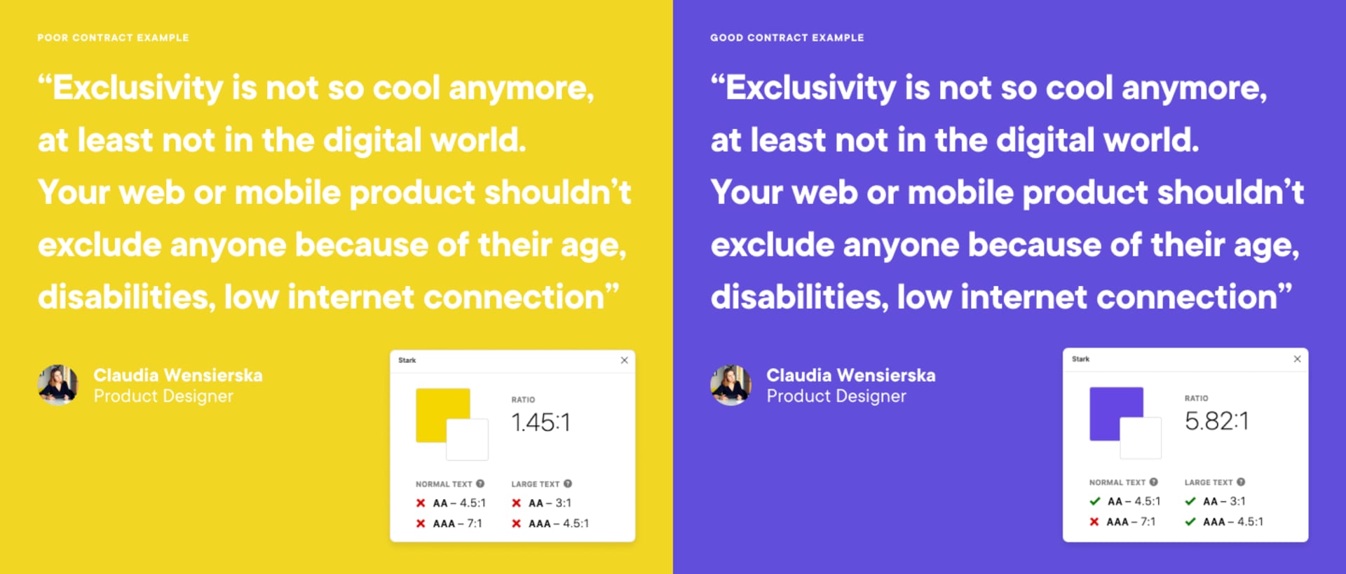
Exclusivity is not so cool anymore, at least not in the digital world.
Your web or mobile product shouldn’t exclude anyone because of their age, disabilities, low internet connection (yes, the performance of your website counts more than ever!) or older hardware.
Most designers are using high-end tools, expensive monitors and are young and healthy. However, we need to remember that users who use products designed by those young and creative specialists aren’t always that lucky. If you want to check on how accessible your last app is, simply test it in the open air in the middle of a sunny day. Is there enough contrast to see through a screen that is exposed to bright sunlight?
But accessibility is not only about contrast. It’s also text size, alternative texts for screen readers, and other crucial indicators described in the WCAG (Web Content Accessibility Guidelines). If you’re a designer, you should already know plugins like Stark for Sketch and Figma. They’re a huge help in terms of checking accessibility and you should get familiar with them as soon as possible - I’m using them already.
“Why should my digital product be inclusive? After all, it is not a product for disabled peop..”
You better stop right there!
Accessible design is not about disabilities. Still not convinced? Try to use your smartphone at noon, with full sun, and boom! You’re kind of working with a disability, because you’re not able to read anything on your screen. Does it make sense now? You need to consider different situations, when the target user does not have the full “capability” to use their device and your app.
The contents of your web or mobile product should be accessible for everyone, period. If your service is exclusive, users will simply choose your competitor’s website - sooner or later.
2. UX writing and microcopy
Do you know that you can also exclude someone with your copy? Sometimes, we use sophisticated words to highlight how smart we’re. OK, your grandma will be proud, but how do you expect to sell something to your user if you’ve already made them feel like a dummy, or they simply didn’t get what you’re saying? Keep your texts simple and understandable. One of the most important rules of proper communications says:
write in a manner that would be understandable for both: a 7-year-old kid and a professor.
It’s not impossible, although it’s definitely challenging at times.
Worried that your copy will suffer because of the simpler voice and tone? No worries - straightforward and understandable copy doesn’t have to be boring. You can use your brand identity through your UX copy to make it attractive. Users want to be a part of the brand, its history, and uniqueness. You can add a pinch of humor if you know your target group well or be a little quirky by appealing to their knowledge or interests.
Other, often overlooked websites or application elements are microcopies. To improve the business value your products have, change your standard, boring buttons (“Click here”) to catchy Call To Action buttons (“Click here - that’s the spot!”) to improve your conversion rate. But not all businesses can be so peculiar in their communication! Try to capture your brand’s voice, tone and atmosphere and catch users’ attention. Create memorable experiences and make them come back to you for more!
3. Conversion over beauty
Of course, it’s nice to have a beautiful, trendy app with all those gradients, animations and shadows. But what ‘s more important is making money - it’s as simple as that. In most cases, you’re building a product for profit. Thus, one of your indirect goals should be to improve conversion rates.
If you as a product designer, or the product designers that are working in your team, understand this, you are already ahead of the field. This attitude is a huge advantage over teams that prefer to focus on beauty instead of practicality and business.
At Boldare, we don’t have just “UI designers” or “UX designers”. We work with Product Designers that are fluent in business and analytical skills. We not only have amazing visual designer skills, but we’re also here to help with your business goals and, if it’s needed (and mostly it is), your conversion rate. We know how to track users, articulate verifiable hypotheses, analyze traffic on your website and get other insights that can be used to propose and design future improvements to your product.

In our work environment, there’s no place for pointless discussions with stakeholders on which color we prefer or where we should put a call to action button.
Our clients are not the end customers, and neither are we.
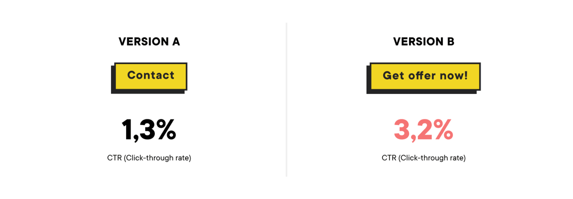
So, instead of gambling on a solution, we prefer to do our research and make our decisions based on the data we gather. For example, in the case of where to locate a call to action button, we would prepare two different versions and run an A/B test. By comparing the conversion results in both scenarios we will have our answer on which button’s location is better (for your audience and your business). Don’t be surprised - your prefered version won’t always “win”. Even if something looks like a great idea, it’s possible that it will not work for this specific audience. Even if you think you know it very well.
My personal pro tip here is to always start the design process with a business goal, setting hypotheses and preparing A/B tests. Maybe 2021 is a good time to improve your analytical skills? If you’re not sure how to do it, learn more about the popular tools (HotJar is the one we use, but there’s plenty of similar options), tracking goals, monitoring and feedback gathering.
4. Funnels
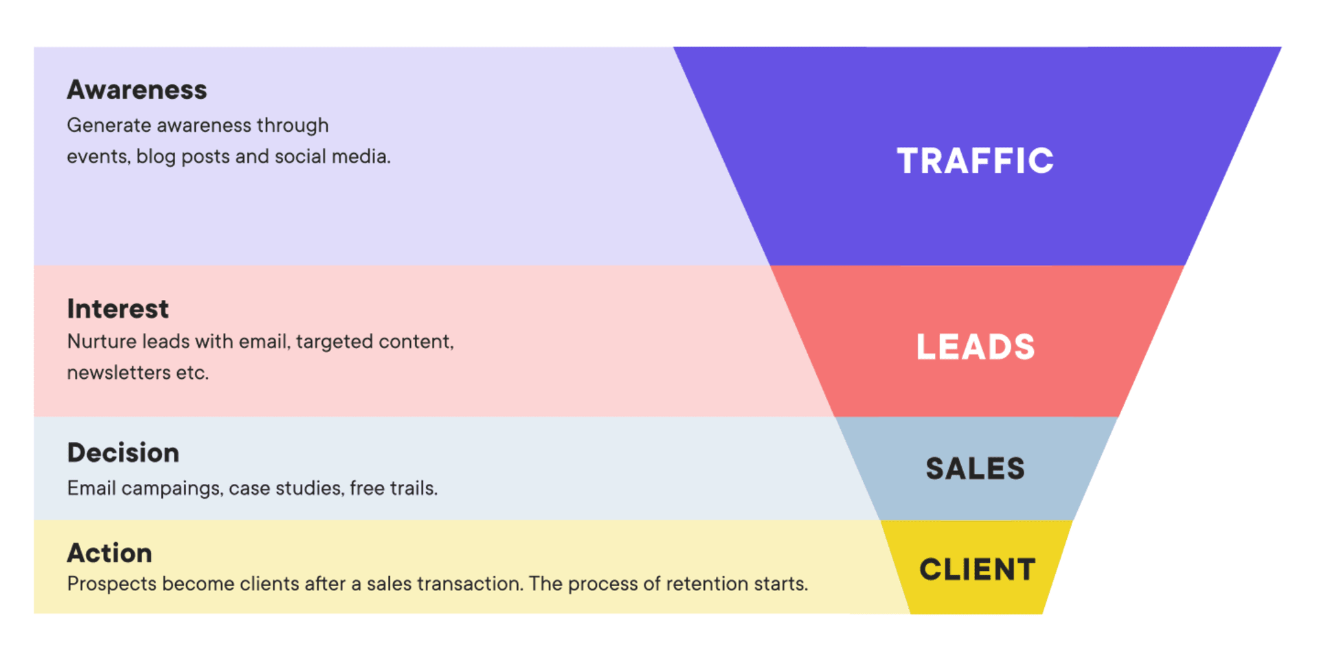
This is another topic related to conversion on your website. To design a better website (in terms of business) you need to understand the concept of sales funnels and the role of the website in the selling process of your product or service.
Once you understand the concept of the funnel and its stages, you (or your UX design team) will be able to design better conversion points on your website. Funnels are strongly connected with the user journey. It’s good to know how customers explore your website or app and what paths they use to reach the goal: a purchase or other type of conversion.
In most cases, your e-commerce website or blog are at the very top of the funnel, because they attract first-time users. Purchase is at the bottom of the sales funnel. The role of a product designer is to help guide and convert anonymous web visitors into paying customers, from the top to the bottom of that funnel. How to do it?
Imagine that you’re using social media to promote your new blog post. The user journey would look like this: user sees a Facebook post with nice graphic design and decides to click it to read your article. They’re redirected to your website.
This is the first stage.
You don’t know too much about this user right now. They will probably leave a trace in the form of cookie files, so you can check later (as long as you’re using an analytical tool, like Google Analytics) for the source of the visit (we already know that’s Facebook), the device they’re using, and their geographical location.
So you know that they’re interested in the article’s topic, the product or your services, however you’re still not able to contact them.
So how to change that? You need to convert them from an anonymous visitor into a lead - a user that you can identify by an email address or, at the least, a name.
How? If the user is not ready to make their first purchase (they rarely are after the first visit), you can offer something for free while they are on your website - an ebook, webinar or newsletter - in exchange for their email address. Once you have the email you can send them other materials as part of a process of nurturing the potential client, encouraging them to return to your website for more content or interesting offers. This is another stage of the funnel.
You should have a set of solutions (actions that lead to conversion) for every stage of the funnel. You will see what mechanisms are working on your audience and how your conversion is growing. You can use A/B tests to be sure that you’re using the best possible assets and conversion points. There are a lot of tools which will help you with automatization at every stage, like HubSpot or Mailchimp.
The funnel should be designed with the whole marketing team, but it’s the role of the product’s UX/UI designer to make it really efficient. Funnels that lack stages or are too short will be harmful to the purchase process and, as a result, for the whole business.
5. Personalization
Putting the name of the user in the email title is not enough anymore. There are many great analytic tools that can help you with data gathering and analysis. How you use this information is up to you, so how can you use it efficiently? Which data is potentially useful? If you’re using analytics tools like Google Analytics or Hotjar, you can easily find out the gender of your user, and their country, region, language, age group, occupation, and interests.
Now, the personalization part begins.
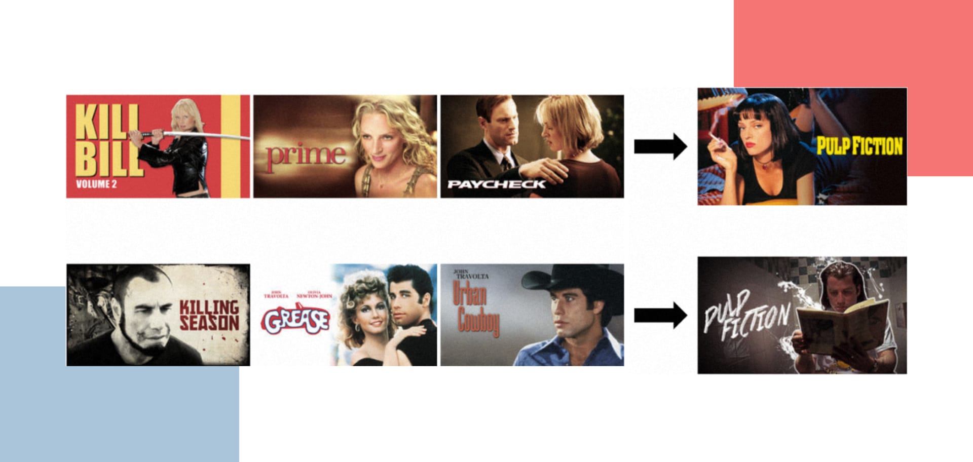
Based on that information, you can personalize content on your webpage to particular user groups. You can adjust the tone of voice of the copy and images according to the target user group. A company that has mastered this is Netflix. They check which movie images perform the best in grabbing our attention. The images are different for different groups of people, based on what has been shown to work better, historically. They also use personalization to show us categories based on our previous choices, which helps us to choose what to watch and therefore consume more content.

What can you do about it? If you know your audience (and you can use the mentioned tools to know it better) you can adjust the look of your product to grab their attention and make them more likely to interact (and maybe even convert) with the app or website. The better you know your audience, the more it’s willing to stay with you.
6. Performance, animations and motion
5G is getting real and it’s very close to becoming the standard for communication on a daily basis. The iPhone 12 is ready to use 5G standards and most smartphone manufacturers will use this technology in their products as well. What does it mean to us? Better high-speed internet connections to make use of!
Soon you can forget about loaders, because thanks to 5G’s speed and quality everything will be almost instant. There is also a chance to use more motion, animation and real-time 3D renders without losing website or app performance. It opens up new ways to amaze users with exceptional, jaw-dropping design limited only by your imagination and… skills! It’s really exciting!

This means that 2021 is a good year to improve your animation and 3D skills, because soon you will need them more than ever. If you’re responsible for a graphic design team in your company, make sure that any new talents that you wish to hire are aware of this and they know how this change can influence their work. Broad usage of 5G technology will also boost the development of AR (Augmented Reality) and VR (Virtual Reality) technologies.

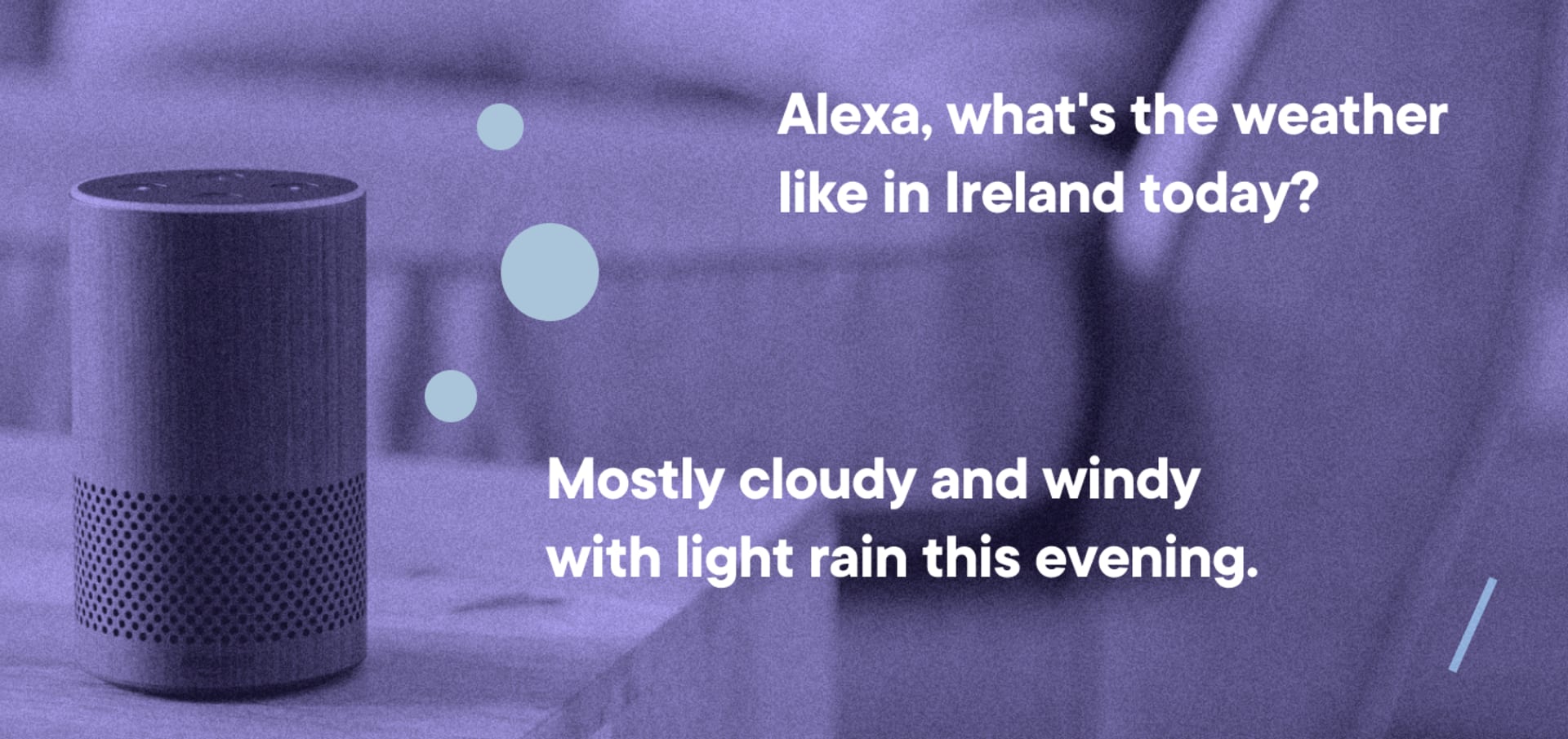
7. Voice-enabled interfaces
When it comes to VUI (Voice User Interface) I’m a little bit sceptical. Every year I read that it will be the hottest technology trend and.. nothing happens. Maybe it’s just that the process of popularizing voice assistance is not as rapid as its manufacturers say it is and it will become increasingly popular at its own, slow pace. Or maybe we are just a step away from a huge boom that will change the landscape!
It’s very helpful to use Siri when you have smart home gadgets or wearable devices like Apple Watch. Also it is a huge improvement that makes car journeys much safer. It allows you to call somebody, make notes, change a song and send a message without using your hands. It obviously has dozens of other great usage examples. On the other hand, designing voice interactions is really tough, because users don’t see the actual interface and they don’t know what options they have.
This means that while VUIs are a part of the whole user experience, we can’t apply UX rules and standards to voice commands.
This paradox is surely challenging for product designers and the situation requires a new way of thinking about digital products with voice extensions.
Even if it’s not the hottest trend of the year and VUIs are late bloomers, stay tuned and keep your eyes open. It’s good to know how to approach it and be prepared for when you will need to use it.
8. New era of responsive screens
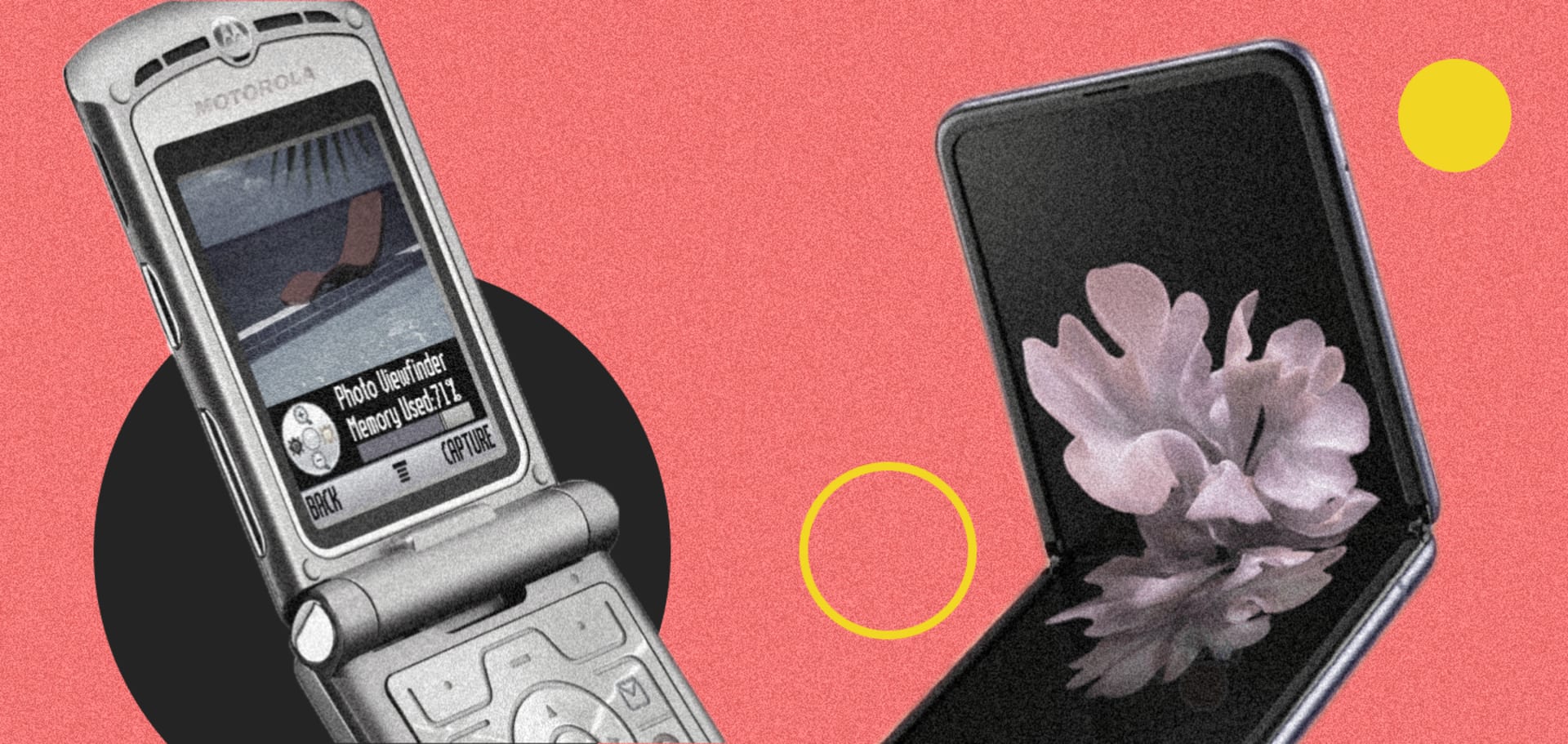
Foldable displays are one of the UI/UX design trends that have recently gained importance. New foldable displays have made it necessary to think again about responsive screens. While we are at the very early stage of adoption, and there are still not many manufacturers who provide such devices globally, the market is predicted to grow from a value of $65m in 2018 to $18 billion in 2025, and global industry shipments are expected to exceed 155 million units by the same year.

Despite this optimistic data, it’s hard to predict whether foldable devices will be as popular as expected. They might be a new game changer, or just another trend that will slowly fade away. Regardless of future events, it’s good to follow this trend and try to rethink your approach to mobile designs that include foldable displays. I must admit that it seems to be a new, higher difficulty level in the game, and this is why it looks so exciting!
How to prepare yourself?
It looks like a lot of stuff to be aware of and to get prepared for, right? Of course, I don’t think that every single product designer has to learn all of the above mentioned skills - it’s impossible to be good at everything. However, knowing what’s “hot” for users and product stakeholders definitely helps in creating better digital products. Getting to know in which direction design is evolvings helps to exercise your own mind and improve your current skills. So, the best way to get prepared is to be up to date first! Besides, today’s trends could be tomorrow’s main issue and the subject of your own expertise!
Share this article: